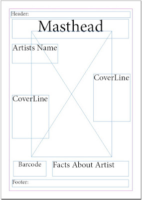
This
is my initial idea for the front cover of my music magazine, the header will be
right at the top and will essentially say something about the magazine and will
hopefully catch the audience's eye. (The footer has a similar job). The main image will be of the artist and is
directly in the middle of the page and the biggest part on the magazine. Firstly because that month is all about them. Secondly to show who people should look out for in the future. My masthead is also one of the
largest things on the magazine, this is so people can clearly see what the magazine is called and so it can stand out on a shelf which contains lots of magazines.
Also on my front cover is the artist's name. This
is because he is new to the industry and not many people will know him. In addition I
have cover lines which hint about what's inside the magazine as this will help
people understand if they will like this magazine or not, also a section which
gives some facts about the artist which could result in the audience relating
to the artist, plus this will help the to understand the artist a bit more.
No comments:
Post a Comment